← writingentry #001
Notes toward a quieter interface
What I kept, what I threw out, and why most good typographic decisions turn out to be subtractions.
Contents05 sections
I rebuilt this site three times before it felt right, and every round removed something. The first version had a colour accent, a hero image, animated page transitions and a sidebar of recent posts. The current one has two typefaces, a hairline grid and almost nothing else.
This is a log of why. It is less a set of rules than a record of which decisions actually changed how the pages read, as opposed to how they look in a screenshot.
Start with the paragraph
A blog is a container for paragraphs. Before choosing a palette or a layout, I set a single block of real text, a few hundred words from an old draft, and tuned it until I could read it for ten minutes without noticing the typography at all. Everything else on the site is built outward from that one block.
Measure
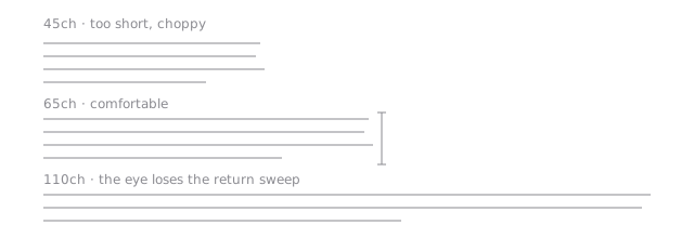
The length of a line matters more than almost anything else. Too long, and the eye loses its place on the return sweep. Too short, and the rhythm breaks into fragments. The long-standing guidance from book typography puts the comfortable range somewhere between 45 and 75 characters, with around 66 as a sweet spot for a single column1.
Here the body is capped at 65ch. Because ch is relative to the font, the measure stays correct when the font size changes at different viewport widths, with no extra breakpoints.
Line height and rhythm
Body text sits at a line height of 1.7. That is looser than most UI defaults, and deliberately so: a serif with a modest x-height at around 19px needs the air. Paragraph spacing is a little under one line, so paragraphs read as distinct thoughts without the page turning into a list.
Headings get the opposite treatment. They are set tight, with little space below and a lot of space above, so each one visibly belongs to the text that follows it rather than floating between sections.
Two typefaces, two jobs
The whole site uses exactly two families, and they never swap roles.
The serif carries the argument
Titles, headings and body copy are set in Newsreader, a serif drawn for on-screen reading with an optical size axis. At display sizes the letterforms tighten and the contrast increases; at text sizes they open up. That one axis does work that would otherwise take two separate fonts.
The monospace carries the metadata
Dates, reading times, tags, navigation and every structural label are set in JetBrains Mono, small, uppercase and tracked out. Monospace digits line up in columns, which matters for a list of dates, and the contrast with the serif makes it obvious at a glance what is content and what is apparatus.
If a reader ever has to wonder whether a piece of text is part of the essay or part of the interface, the typography has failed.
Structure instead of decoration
The aesthetic I wanted was somewhere between a technical drawing and an early-2000s data sheet: crisp, a little cold, obviously engineered. The easy way to get there is with effects: glows, scanlines, glitch animations. The harder and better way is with structure.
- Hairlines. Every division on the page is a single 1px rule in a light neutral. Nothing is boxed in heavier than that.
- Index numbers. Sections are numbered
01,02,03, and subsections02.1,02.2. The numbers sit in the margin of attention, useful when skimming and invisible when reading. - Brackets and labels. A summary box gets
[ TL;DR ]set into its top border. A collapsible aside gets[+]. Small, consistent, typographic.
What got cut
| Idea | Why it went |
|---|---|
| Colour accent for links | Underlines already do the job, and colour fought the monochrome. |
| Hero images on every post | Most posts don’t have a natural image, and stock filler is worse than nothing. |
| Animated page transitions | Pleasant once, tiresome by the fifth click. |
| “Related posts” sidebar | Competed with the table of contents for the same space. |
| Custom cursor | Never once improved anything. |
Small things that add up
A handful of details don’t show up in screenshots but change how the site feels over a long read:
- A 1px progress line at the very top of the viewport, so you always know roughly how far through a piece you are.
- A table of contents that highlights the section you are in. On a phone it folds into a drawer above the post.
- Footnotes for asides that would otherwise derail a paragraph, with a link back to exactly where you were2.
- The theme is applied by a tiny inline script before the first paint, so dark mode never flashes white on load.
Why dark mode uses a slightly lighter weight
Light text on a dark background tends to look heavier and slightly blurred than the same text dark-on-light, an effect sometimes called halation. It is especially noticeable for readers with astigmatism.
To compensate, the body weight drops from 400 to about 380 in dark mode. It is a variable font, so that is a single CSS custom property:
:root {
  --prose-weight: 400;
}

:root[data-theme='dark'] {
  --prose-weight: 380;
}

.prose {
  font-weight: var(--prose-weight);
}
The difference is hard to see side by side and easy to feel after twenty minutes.
None of these needs a framework or an animation library. The entire client-side script for a post page is a few dozen lines.
Closing
The test I keep coming back to is simple. Open a long post, read it start to finish, and notice how often the page itself gets in the way. Every round of changes on this site was an attempt to push that number closer to zero.
It’s not there yet. But each version so far has been better than the last, and every one of them was smaller.
comments
loading…
no replies yet. write one below, or select any sentence above to reply to it.
comments are read-only on this copy of the site (no comment server attached).